

Video Training → Nano Tips for Data Storytelling and Visualization with Lachezar Arabadzhiev
Published by: voska89 on 24-02-2023, 22:51 |  0
0

Welcome to our Nano Tips series, where LinkedIn Learning creators deliver impactful lessons in literally seconds. In this course, Lachezar Arabadzhiev teaches you how to best use data visualizations to get your message across. Lachezar gives you tips and tricks to make sure your insights don't get lost in a bunch of visual noise. He explains how to create visually expressive charts by establishing a clear focal point, optimizing charts for their respective mediums, applying text and fonts strategically, using color cues, and more.
Released 2/2023
MP4 | Video: h264, 1280x720 | Audio: AAC, 44.1 KHz, 2 Ch
Skill Level: Beginner | Genre: eLearning | Language: English + srt | Duration: 10m | Size: 72.2 MB
Video Training → Data Analysis and Visualization with R for beginners
Published by: voska89 on 24-02-2023, 05:52 |  0
0
Data exploration and Visualization using R
Instructors: Bluelime Learning Solutions | 2 sections • 28 lectures • 1h 59m total length
Video: MP4 1280x720 44 KHz | English + Sub | Updated 2/2023 | Size: 734 MB
What you'll learn
Video Training → Python Data Visualization Dashboards With Plotly & Dash
Published by: voska89 on 24-02-2023, 04:17 |  0
0

Published 2/2023
MP4 | Video: h264, 1280x720 | Audio: AAC, 44.1 KHz
Language: English | Size: 3.37 GB | Duration: 8h 35m
Create custom Python visuals, interactive dashboards and web apps using Plotly & Dash, with unique, real-world projects
What you'll learn
Video Training → Zero to Hero in Tableau Data Visualization using Tableau
Published by: voska89 on 22-02-2023, 01:37 |  0
0
Published 2/2023
Created by Start-Tech Academy
MP4 | Video: h264, 1280x720 | Audio: AAC, 44.1 KHz, 2 Ch
Genre: eLearning | Language: English | Duration: 59 Lectures ( 8h 21m ) | Size: 3.06 GB
Video Training → Visualization for Data Science using Python
Published by: voska89 on 20-02-2023, 08:11 |  0
0
Pandas, Matplotlib, Seaborn. Analyze Dozens of Datasets & Create Insightful Visualizations
Published 2/2023
Created by Newton Academy
MP4 | Video: h264, 1280x720 | Audio: AAC, 44.1 KHz, 2 Ch
Video Training → Excel Data Visualization-Dynamic Charts & Graphs [Part-2]
Published by: voska89 on 20-02-2023, 01:39 |  0
0
![Excel Data Visualization-Dynamic Charts & Graphs [Part-2] Excel Data Visualization-Dynamic Charts & Graphs [Part-2]](https://i121.fastpic.org/big/2023/0220/3f/bb99393ec906124787d62b81debc543f.jpeg)
Learn to use Excel Form Controls & PivotTable (spin button, scroll bar, slicer,...) to create dynamic charts & graphs.
Published 2/2023
MP4 | Video: h264, 1280x720 | Audio: AAC, 44.1 KHz
Language: English | Size: 827.43 MB | Duration: 1h 32m
Video Training → Unreal Engine 5 - Architecture Visualization/Interior Design 2023
Published by: voska89 on 16-02-2023, 09:35 |  0
0

Published 2/2023
MP4 | Video: h264, 1280x720 | Audio: AAC, 44.1 KHz
Language: English | Size: 1.21 GB | Duration: 1h 23m
Learn the basics of Unreal Engine 5 by making Interior Scenes
What you'll learn
Video Training → Data Science 101 Python Data Visualization for Beginners
Published by: voska89 on 12-02-2023, 08:09 |  0
0
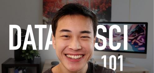
Data Science 101: Python Data Visualization for Beginners
Content Source:https://www.skillshare.com/en/classes/Data-Science-101-Python-Data-Visualization-for-Beginners/1224936872?via=user-profile
Genre / Category:Other Tutorials
File Size :256MB
Video Training → Linkedin - Data Visualization with Canva and Flourish
Published by: voska89 on 10-02-2023, 13:11 |  0
0

Released 2/2023
MP4 | Video: h264, 1280x720 | Audio: AAC, 44.1 KHz, 2 Ch
Skill Level: Beginner + Intermediate | Genre: eLearning | Language: English + srt | Duration: 30m | Size: 272 MB
In this course, Lachezar Arabadzhiev provides an introduction to the world of data visualization using Canva and Flourish, and explains why visualization is critical to the big picture of product design. Lachezar shows you: how Canva's tools can be leveraged for data sharing and storytelling; how Flourish can add richness and context to data visualization; the key types of data visualization for designers and product teams; how to build a story around your data that gives the bigger context; and how to structure your narrative to reach the right audience. Whether you're a designer, creative, marketing pro to convey rich stories to accompany your data analysis, or an experienced Canva user who wants to be more prolific in business scenarios, check out this course to get started creating data visualizations.
Video Training → Frontend Masters - Data Visualization First Steps
Published by: voska89 on 4-02-2023, 16:18 |  0
0
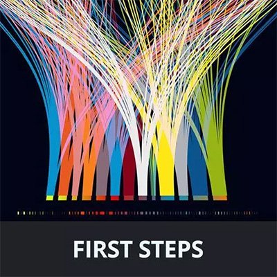
Anjana Vakil | Duration: 3:27 h | Video: H264 2560x1440 | Audio: AAC 48 kHz 2ch | 1,84 GB | Language: English
Instead of staring at spreadsheets of data, you can turn that data into something visual and interactive! It allows you to explore and answer questions about the information quickly. In the course, you'll build hands-on projects with the Observable Plot library. You'll make visualizations or "plots," add interactivity and embed your plots around the web with javascript and frameworks like React. By learning these fundamentals, you'll be able to have what you need to move on to more complex work with d3.js and beyond!
Homepage


